
Remember the old "Don't call it a phone" ads for wireless company Helio? I was reminded of the "don't call it" imperative when I first laid my fingers on the new Palm Pre from Sprint this evening. Everyone wants to know how it compares to Apple's iconic handheld. Is it an iPhone killer?
No, it's not. And that's not a bad thing. It's simply different. Despite having a capacitive touchscreen, snappy animations and even many of the same designers (defects from Apple's iPhone team), the Pre is a very different device.
"Smaller dimensions don't sacrifice usability"
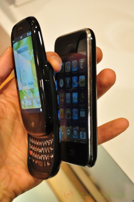
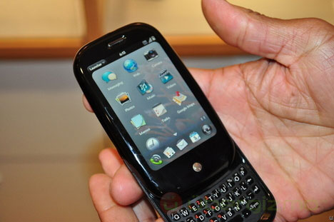
For one, it's so much smaller. At only about two-thirds as tall and about 20 percent narrower, this Palm fits easily in your palm (no matter how small your mitts) and slips easily into a pocket. Even with the screen slid up and the tiny keyboard exposed, the Pre is an amazingly tight package – something you can't appreciate from photos but only by actually handling it. Being so petite, it breaks the whole perception of smartphone as a synonym for "brick."
"The Pre's keyboard is incredibly accurate"
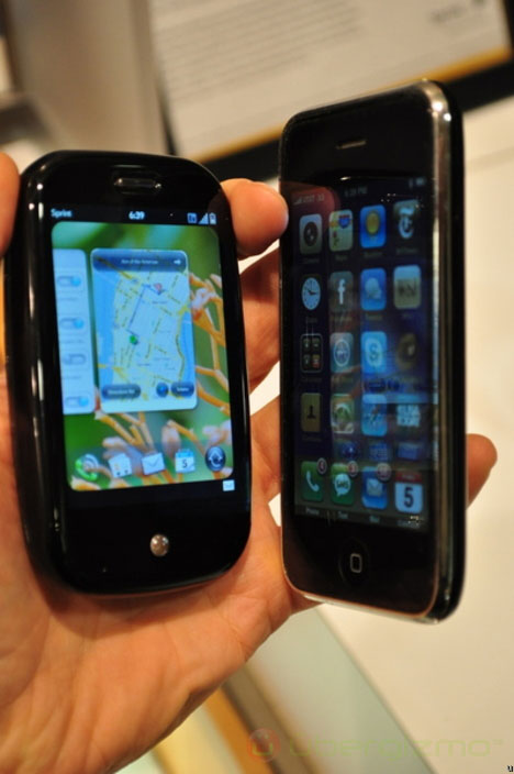
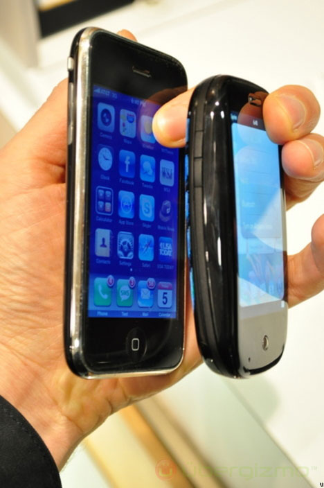
But the smaller dimensions don't sacrifice usability. Sure, you have a bit less screen (3.1 vs. 3.5 inches diagonal on the iPhone). But you can use the whole thing. Sporting a mechanical keyboard, the Pre doesn't need to sacrifice the bottom half of its LCD as the iPhone does with its soft keyboard. And despite being genuinely tiny, the Pre's keyboard is incredibly accurate. The rubberized little buttons held on tightly to my fingertips, so that I didn't produce a single typo –more than I can say about my experience on a full-size laptop. (And it's a world apart from the wild key mashing that happens on the iPhone's virtual keyboard.)
Palm's WebOS operating system also uses the screen very differently. Tapping the (OK, iPhone-like) center button below the screen reduces program windows to "cards" that float onscreen like windows on a computer desktop. Like all animations on the Pre, switching to the card view takes a little longer than you think it should, making you wonder if it's really going to happen. But it's worth the wait. Flicking the cards back and forth to select among open apps is so much faster than closing one app and starting another one on the iPhone. This multitasking approximates the Windows or Mac experience more than any cellphone I've ever touched.
The Pre also has a different take on gestures. In addition to multitouch sliding and pinching (to zoom in or out), it allows you to swipe along a touch-sensitive strip below the screen. Sliding your finger to the left, for example, backs out of a program one step at time. So, for example, after creating a calendar entry, I could back out first to a view of the entire day and then back out to the "card" view of all my open applications.
"Another huge time-saver is the universal search function"
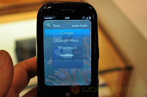
Another huge time-saver is the universal search function. From virtually anywhere, simply start typing a name or word, and Web OS automatically presents you with any of the venues you might search for it. For example, while in the card view, I typed "Susan Boyle" and was presented with options to look up the flash-in-the-pan chanteuse on Google, Wikipedia, or Twitter – all the places where the search engine found her name. If Susan and I were pals, and she were in my address book, that search option would have come up as well. Ditto with the calendar if we had a lunch date on the books.
"In some aspects, however, the Pre is in fact like the iPhone"
I know it may appear that I am, in fact, comparing the Pre to the iPhone by saying how much better it is. But for everything I see as a benefit, other people may see as drawbacks. I like the mechanical keyboard, but some aesthetes may look down on the two –piece sliding design of the Pre and instead prefer the monolithic slab of the iPhone. Likewise, the power multitasking that I love could be too busy for people who like the one-thing-at-a-time, easy-to-get-home navigation on the iPhone.
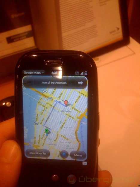
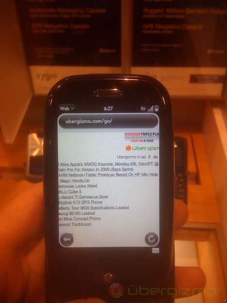
In some aspects, however, the Pre is in fact like the iPhone. It also offers Google Maps, for example, and they pop up slide around about the same as on an iPhone, which is to say, a bit slowly and a bit choppily. Web browsing seemed to be about the same as well. The Pre's browser did launch a bit quicker, but the surfing experience was similar, at least in my very limited tests This was surprising, given Sprint's powerful EV-DO data network and AT&T's own-far-from-loved 3G service.
Just before I handed the Pre back to its very patient owner, Sprint marketing president Paget Alves, I remembered one more thing I should test – call quality. I quickly dialed my sister in LA (on her landline). Despite being in the bustling-loud Sprint store in Manhattan, I heard her crystal clear, as she did me. "You sound much better on this than on your own phone," she said, referring to my iPhone. So, unlike with Helio's old handhelds, you can indeed call the Pre "a phone."
Courtesy to : - http://www.ubergizmo.com/15/archives/2009/06/palm_pre_review_dont_call_it_an_iphone_killer.html

No comments:
Post a Comment